Associate Professor Stephanie Frampton’s Media in Cultural Context (21L.715) is a seminar about the pleasures and powers of reading: “From the Sumerian clay tablets of more than four millennia ago through the spectacular emergence of the electronic text, the written word – in all its forms – has captivated the human mind, embodied our insights into the world around us, and made enduring our most profound artistic creations and scientific discoveries.” As part of their journey into the history of the book, students attend weekly “lab” sessions in the MIT Libraries’ Institute Archives and Special Collections, where they get to dig deep into historical books and other media.
The following are excerpts from students’ critical analyses of objects from the Institute Archives and Special Collections. Read the full entries on the class blog, and watch for more projects added over the course of the semester.
 The Wonders of Plants and Fungi Across the Centuries
Alissa Borshchenko
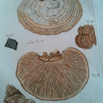
In investigating three wonderful pieces containing botanical illustrations in the MIT Special Collections library, I wanted to highlight the progression of printing and coloring technique and how that paralleled the deepening of scientific understanding over time. From wood cuts and simple coloring schemes at the end of the 16th century (John Gerard’s Generall Historie of Plantes) to black and white copper engraved plates (Nehemiah Grew’s Anatomy of Plants) and finally to richly colored engraved plate images of mushrooms in Bavaria (Schäffer’s Fungorum qui in Bavaria et Palatinatu) towards the end of the 18th century, it is clear the evolution of printing technology played a crucial role in advancing scientific understanding of the natural world. Read Alissa’s full analysis
 A Leaf of the Polychronicon, Edited and Printed by William Caxton
Cathleen Nalezyty
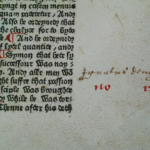
The item is a single leaf from the Polychronicon, written by Ranulf Higden and translated by John Trevisa. The Polychronicon was supposed to be a history of the entire world. In 1482, printer William Caxton recognized the popularity of the manuscript versions of the Polychronicon, and took it upon himself not only to issue a print version, but also to update the “rude and old englyssh” of Trevisa’s original translation. The end result is a printed volume that is mostly readable to modern readers.
The leaf consists of three forms of text: the text of the Polychronicon printed in black ink, red inked notational marks likely done at the time of printing, and and handwriting in brown ink in the margins. It is these marginalia which originally caught my interest. This is where an understanding of the leaf’s history would have come in handy. It may have told us who made these markings and when. Without knowing through whose hands this leaf has passed, answering these questions becomes much harder. Read Cathleen’s full analysis
 Wayne Thiebaud’s “Invisible Cities”
Sam Jacobs
In 1999, Arion Press commissioned artist Wayne Thiebaud to produce illustrations for an edition of Italo Calvino’s Invisible Cities, translated into English by William Weaver. On the idea that “the images of cities and objects remain invisible until the reader takes action,” Thiebaud drew twelve sketches of fantastical cityscapes to accompany the novel’s text. The illustrations are lithographed onto Mylar transparencies, each in a different color appearing in front of a sheet of the same color as the lithograph. The drawings, camouflaged, become visible when the reader takes the action of turning the page, in keeping with Thiebaud’s artistic impulse. The book’s textuality, what makes it worth reading, depends on the reader doing his or her thing. Read Sam’s full analysis
Related Story
The Human Touch
Alice Lu ’16 transcribes a Newton manuscript for Stephanie Frampton’s Media in Cultural Context class.